Roadmap/Concepts · Round 1

Four directions.
One conversation.

This round isn't about picking a finished logo. It's about telling us which direction is closest, what needs to shift, and which tradeoffs matter most to you. Every concept below has a short note on what it does well and what it's asking you to decide. Use the panel on the right to mark your picks as you go — one click and it's ready to send.

Round
01 of 02
Revisions Left
2 of 2
Posted
04 / 24 / 2026
Your Response
By May 4 works
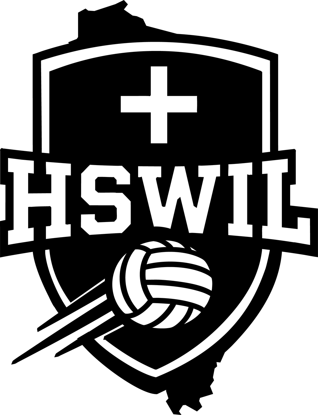
AThe Full Kit
Concept A — Shield with state outlines, cross, and motion volleyball

Shield · States · Cross · Motion

The full-kit option. Every element from the brief, integrated into one mark.
Cross: yes WI + IL: integrated Motion: yes

What it does well

  • HSWIL wordmark runs across the shield — closest to your "across the borderline" language from kickoff.
  • Wisconsin outline shapes the top of the shield; Illinois anchors the base. Reads shield first, geography second.
  • Cross is centered and quiet, so the mark reads competitive first, Christ-honoring second — the balance your brief asked for.

What it's asking you to decide

  • WI outline at the top edge is textured — reads slightly "ripped." We can simplify it.
  • Illinois at the base is partly crossed by motion streaks. More integrated visually, less legible as geography.
  • If you like this one: we simplify the WI top edge, tune the IL integration at the base, and dress it in the recommended palette.
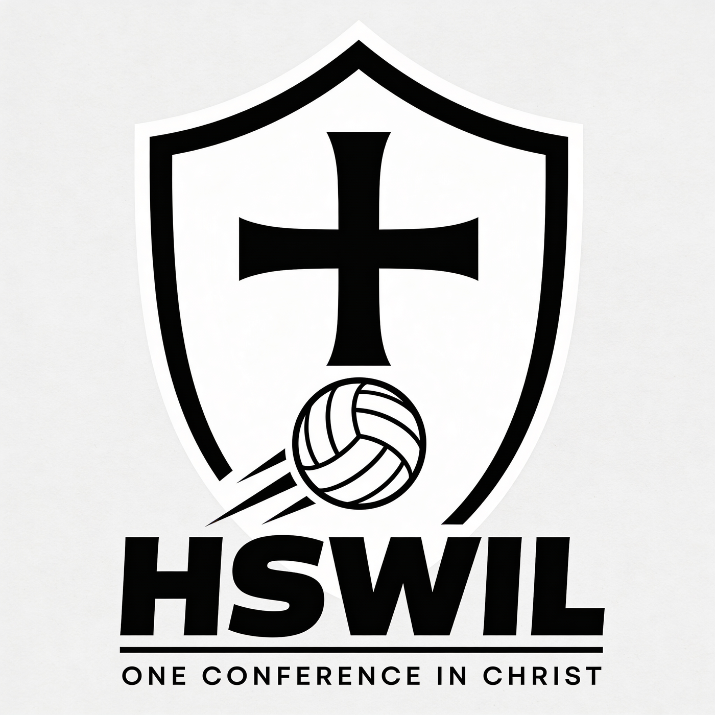
BCross Forward
Concept B — Shield with dominant centered cross

Shield · Dominant Cross · Tagline Lockup

The Christ-honoring reading, front and center. Quiet on motion, loud on identity.
Cross: dominant WI + IL: no Motion: yes

What it does well

  • Cross is large and centered — directly answers your kickoff note to center the cross.
  • Tagline "One Conference in Christ" locks under the wordmark. Strongest explicit-faith read of the four.
  • Cleanest composition at thumbnail — survives tiny sizes (social avatar, email signature) well.

What it's asking you to decide

  • Without WI + IL outlines, the mark loses the two-state conference story — feature or gap?
  • Cross scale leans the mark toward church / ministry before volleyball. We can pull it back 20–30% and it still reads.
  • If you like this one: we keep the centered cross, scale it back, and decide whether to reintroduce state outlines or lean further into the faith-first read.
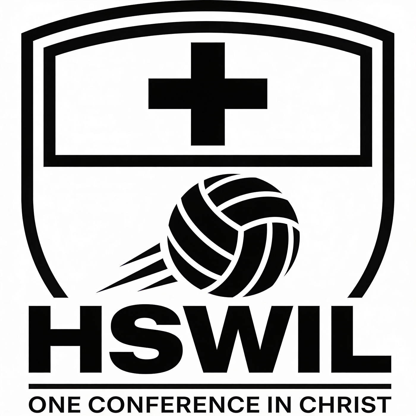
CClean Faith-First
Concept C — Clean shield with centered cross and volleyball

Clean Faith-First

A cleaner cousin of Concept B. Same faith-forward read, cleaner composition, best small-size legibility.
Cross: dominant WI + IL: no Motion: yes

What it does well

  • Most legible of the four at small sizes — the volleyball reads instantly as sport.
  • Typographic wordmark is heavier and more modern than Concept B — ages better for middle and high school audiences.
  • Single-color safe. Best candidate for embroidery and apparel without any rework.

What it's asking you to decide

  • Drops the WI + IL story entirely — we'd want your blessing before taking this forward.
  • Same cross-scale tension as Concept B. If you love this composition, we scale the cross down in round 2.
  • If you like this one: we scale the cross, keep the wordmark weight, and decide whether a small WI + IL mark should live in a secondary lockup.
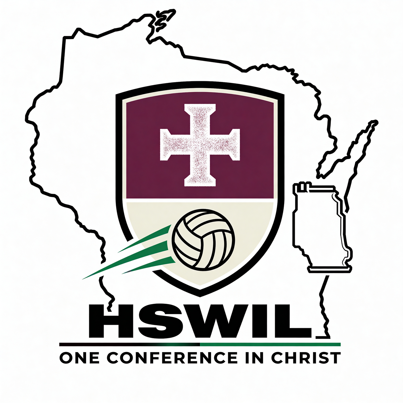
DLiteral States
Concept D — Literal Wisconsin and Illinois state outlines with shield inside

Literal WI + IL with Shield Inside

Closest to the mental picture you described in kickoff. Important palette conversation attached.
Cross: yes WI + IL: literal Palette: needs work

What it does well

  • Both states are fully visible and legible — the two-state conference story is unmistakable.
  • Shield-inside-states layered approach gives the mark depth without getting busy.
  • HSWIL wordmark crosses the state border at the base — exactly the "across the borderline" composition you described.

What it's asking you to decide

  • Current palette uses maroon and a green streak — maroon is already owned by a member team, so we'll swap it before this goes further.
  • The textured cross fill won't reproduce in embroidery or at small sizes — we'd flatten it.
  • If you like this one: we redraw in the recommended palette below, flatten the cross, and produce a simplified one-color variant for apparel.

The palette we're recommending.

We're recommending one palette, not offering a menu — picking color by committee usually stalls. This one honors your Christ-honoring brief, reads athletic, sits inside your in-bounds list, and clears every off-limits combination. If it feels wrong, tell us and we'll pivot in round 2.

Sanctuary Purple
Aa
#6D28D9
Primary · shields, cross, wordmark
Field Green
Aa
#15803D
Secondary · motion streaks, accents
Court Black
Aa
#0A0A0A
Ink · outlines, typography
Chapel Cream
Aa
#F6F4EE
Ground · backgrounds, negative space
● Safe by design
No red, orange, blue, maroon, or teal (owned by your member teams). No green + yellow (Packers). No purple + yellow (Vikings). We're clear on all five forbidden lanes.

From here to final.

APR 24 — 29

You respond

Fill the panel on the right and hit send. Written reply is fine. Call is fine. Whatever's easy.

APR 29 — MAY 4

Round 2 concepts

We take your direction, refine one concept deeply, and produce alternates only where you've asked for them.

MAY 4 — 6

Revision round 1

You flag what's working and what's not. We adjust. You have 2 revision rounds in total, so we use them carefully.

MAY 11

Final delivery

Master files (SVG · PNG · PDF) + email header, social, and embroidery-ready exports. Final $150 due on delivery.

Signal & Story · HSWIL Concept Review · Round 1 of 2 · Day 4 of 21 tc@signalnstory.com · (608) 397-4663